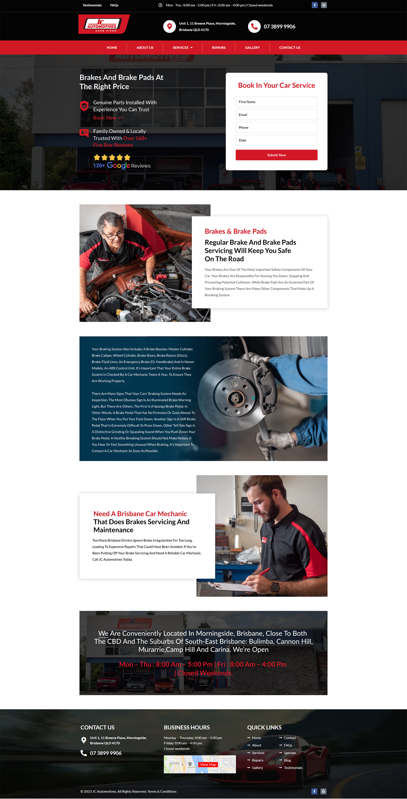
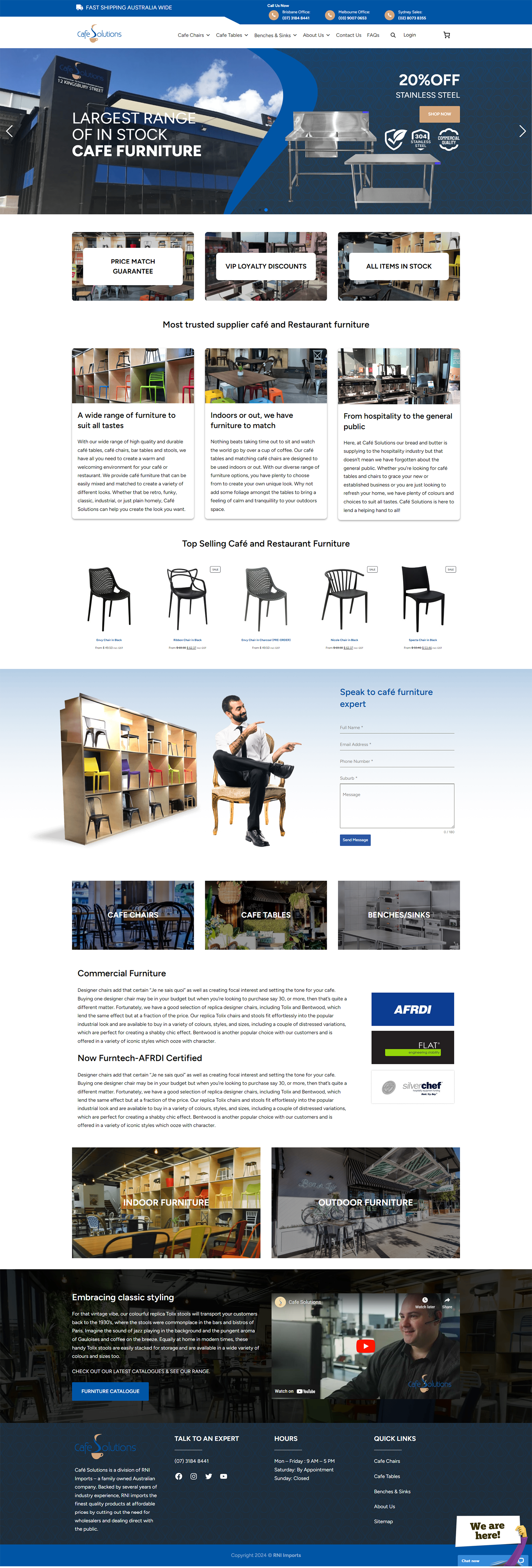
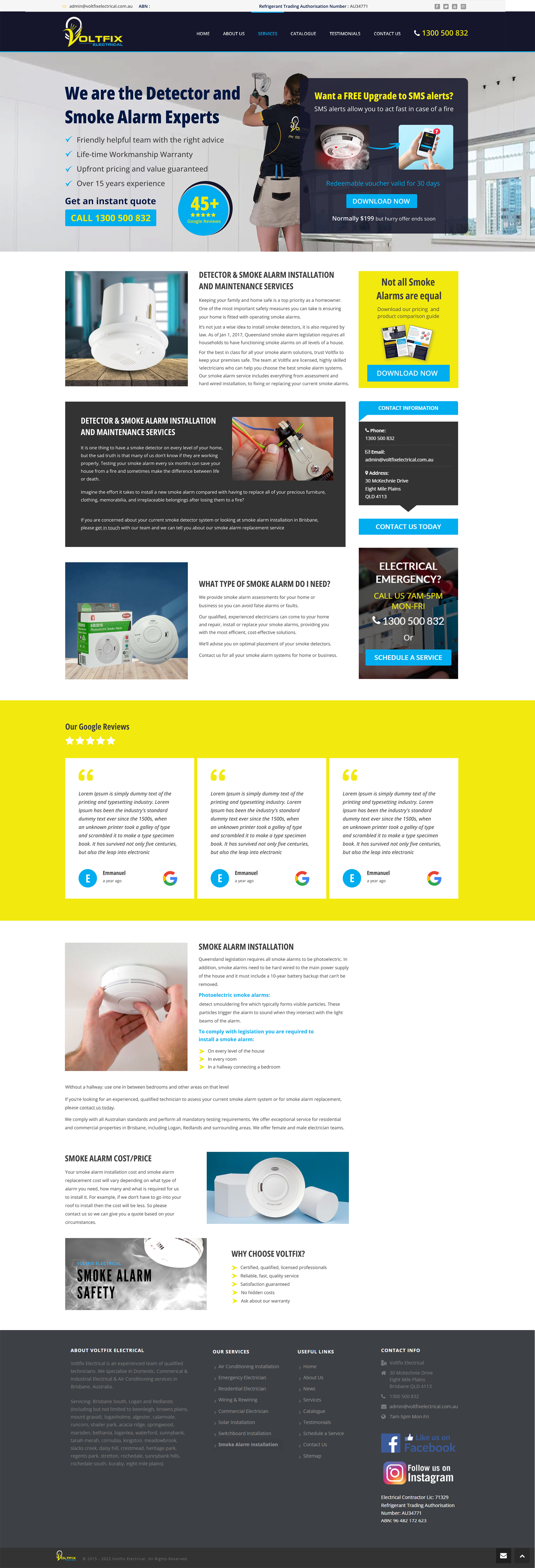
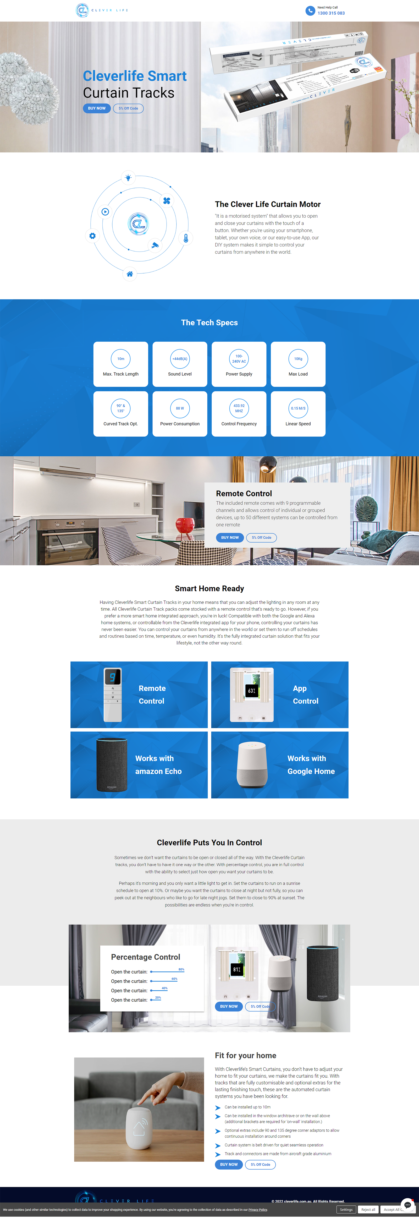
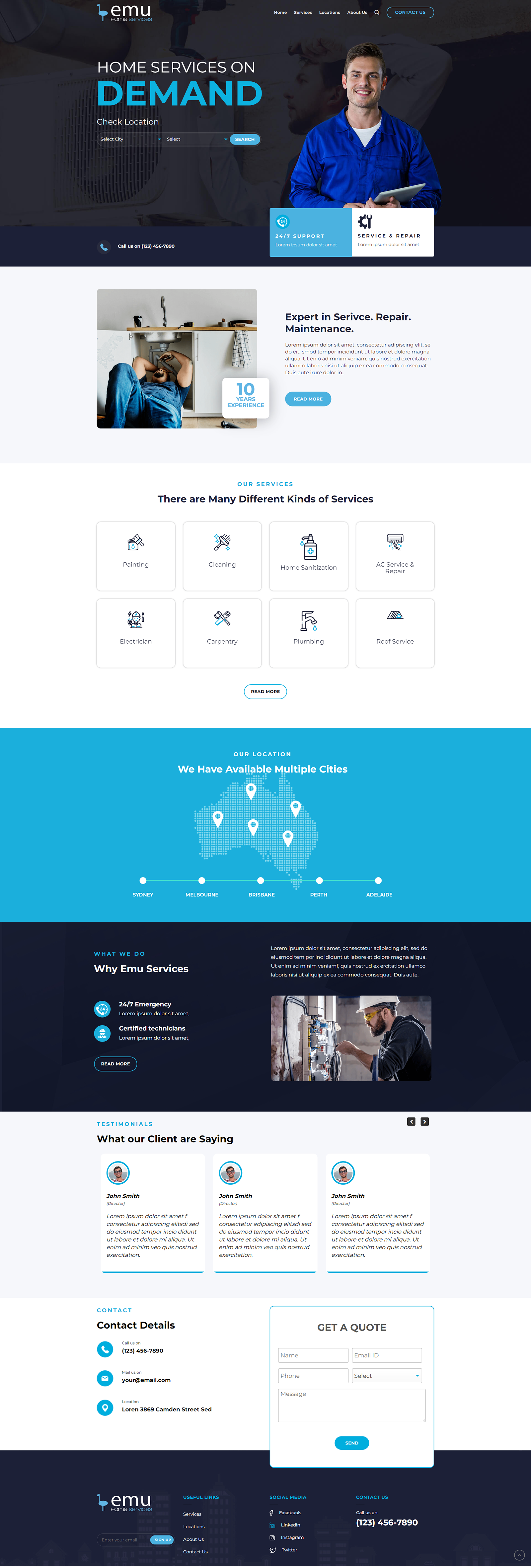
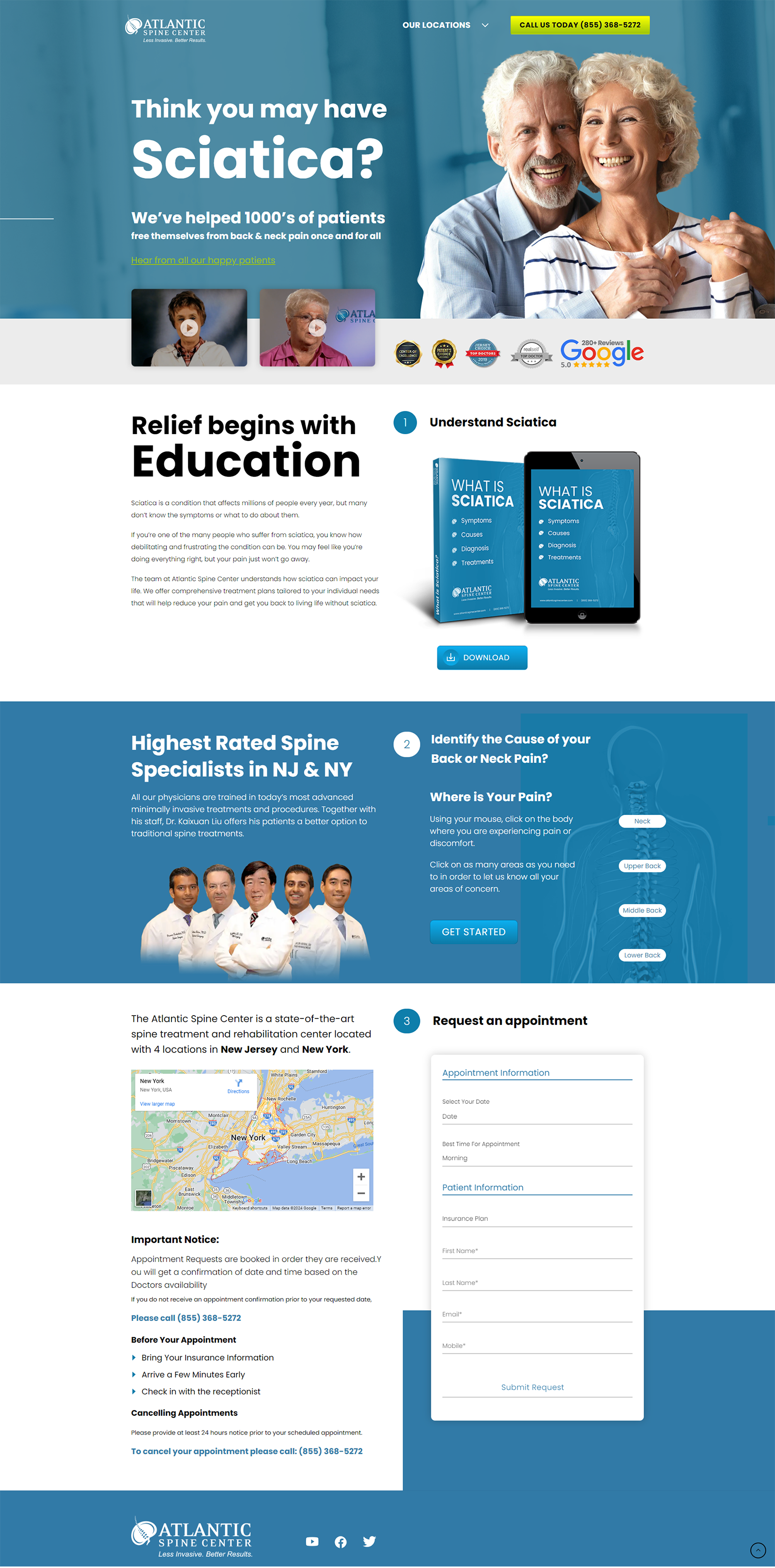
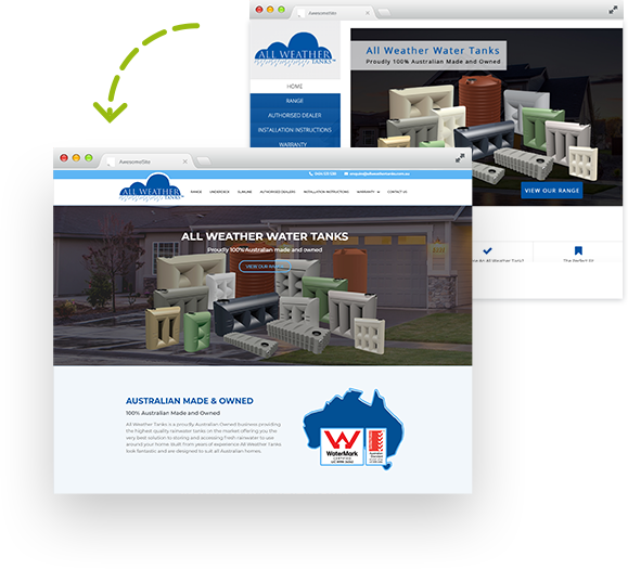
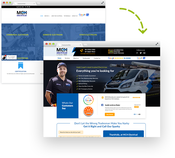
It all starts with the WHO, WHY and WHAT principles of conversion rate optimisation. Innovated and developed by our very own Joseph Wheeler, these simple concepts will completely transform the performance of any website.
Remember if your “Who, Why, What” isn’t all above the first scroll level of the screen, 75% of people won’t see it. So let’s begin.
WHO
- The first question the brain processes is who are you and do I trust you.
- Are you a plumber, an electrician, an online store and what are all the services or products that you provide in a single snapshot?
- It first starts with relevance; am I who you are looking for, and second, an autonomic response that determines fight or flight.
- Who you are is also more than just a brand, it’s a perception of a company run by people. But who are those people and can I trust those people to help me.
- Add some personality to your brand with happy pictures of your team, your office, your warehouse, YOU! (real pictures, not models or stock photos)
- Add images, logos and testimonials of who else trusts and who does business with you.
- Add a brand statement that says something about your brand, be bold and be proud. Don’t be scared to sing your own tune. Confidence is sexy!
- Does your site look like an un-ironed wrinkled t-shirt? Find 5 people to compare your site with your top online competitors and ask which one do they trust more and why?
- In an industry where a compelling USP or competitive edge is difficult, don’t be afraid to stand out and be different. Humour converts, Colour converts, Playful converts.
- What does your website and brand say about who you are?
WHY
- Why should I do business with you, why should I trust you, why should I call you or give you my contact details?
- Now that I know who you are, I want specifics of why you are better than other companies on Google.
- Tell me in short unique selling points that are quick and easy to read, why I should do business with you.
- In addition to your unique selling points, choose a single reason for someone to call you, and make that single reason clearly visible on the website, close to your number or form.
- A common mistake is giving away too much information too quickly, and not giving me any reason to contact you.
- Your website should be a teaser for more information. Remember that websites don’t sell, people sell, so don’t try and make your website do all of the work. Decide what teasers to test and remember to choose only one, you can split test them all later. Remember price isn’t always the best teaser, but it is effective. Here is one from a recent client. “Not all pest control is the same, learn how to get the job done right, the first time – call me now to learn how”
- Giving people a reason to call is a powerful call to action, so get creative. What is the most asked question when someone calls or what do you want to educate them about?
- Remember that people shop on price, but decide on value, because they don’t know what they should know until you tell them. So provoke your visitors with teaser content that gets them thinking about more than just price. What should they know before they decide and turn that into a thought provoking teaser.
WHAT
- What action do you want me to take?
- Where is your call to action positioned on the website?
- Is it clearly visible above the scroll, does it stand out with a highlight colour?
- Is your call to action supported with an icon, or a trust confirming statement?
- “Get the right advice today”, “Call to hear about our special offers”, “Replies within the hour” (for forms)
- Do you have too many calls to action on your page? Stick with one or two.
- Consider using a 70% scroll pop up “call to action” or exit intent pop up “call to action” like Sumo, but not a spammy instant or time based pop up. We all hate those ones.
- “I’m not ready to buy yet, but what can you give me right now in exchange for my contact details?”
- Start learning about lead magnets and how they can create a database that will eventually become a gold mine for your business.
I hope you enjoyed these tips to start compounding your online enquiries.
Call us today and request a CRO audit of all the above information with suggestions customised to your website.

Brendon Comerford
Managing Director / Digital Strategy Analyst
Brendon is our Managing Director and follows a transformational leadership style that inspires trust through a shared team vision. His GM experience for multiple agencies brings both a level of integrity that has lured the best to follow and the lessons to live by in building a stable and talented digital team.


